Part A
1) Christina Aguilera - Christina Aguilera
2) Backstreet Boys - Backstreet Boys
3) Justified - Justin Timberlake
4) In Through The Out Door - Led Zeppelin
5) Because of You - Ne-Yo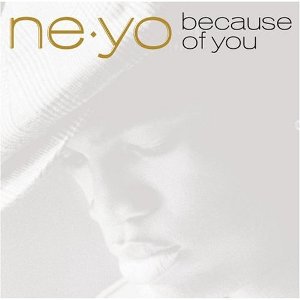
6) Little Ol' Cowgirl - Dixie Chicks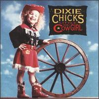
7) Serenade - Katherine Jenkins
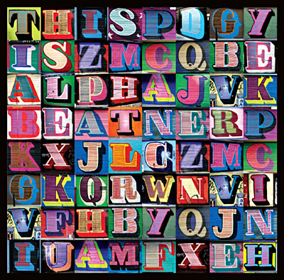
8) This is Alphabeat - Alphabeat

Typical features
- Artist/band name
All of the album covers except for the 'In Through The Out Door' cover have the name of the artist/band on the cover. But, there are also some versions of 'In Through The Out Door' cover which do have Led Zeppelin written on the front - Album name
The Lee Mead, Christina Aguilera and Led Zeppelin albums are the only ones which do not specifically have the album name on the cover. For the Lee Mead and Christina Aguilera covers, the reason behind the lack of album name is that the albums are self-titled. So instead of putting their names twice on the album cover (like on the Backstreet Boys cover), they just put the names once. The Led Zeppelin cover just has no text on it whatsoever, and relies on fans being familiar enough with the band to recognise what the album looks like. - Main image
All of the album covers except for the Alphabeat and the Klaxons covers have a central image. Instead, the Alphabeat cover has a word-search like set of letters, and the Klaxons cover has a collage of different images. - Colour scheme
All of the album covers except the Alphabeat and the Klaxons covers have a specific colour scheme.
Ways of categorising the covers
- Albums with the band/artist as the main image
The Lee Mead, Christina Aguilera, Justin Timberlake, Ne-Yo, Katherine Jenkins and Backstreet Boys albums all use a picture of the band/artist as the main image for the album cover. - Albums with other imagery
The Led Zeppelin cover has an image of what appears to be a bar scene, the Dixie Chicks album has a picture of a young girl dressed as a cowgirl and the Klaxons album has a collage of different images. - Self-titled albums
The Lee Mead, Christina Aguilera and Backstreet Boys albums are all self titled. - Albums where the text is predominant
The Alphabeat album is the only one where text is really predominant. But it could also be argued that the text on the Alphabeat is really imagery... On the Lee Mead album though, the text is relatively large. - Albums where the image(s) /are predominant
On all of the albums except the Alphabeat (unless you consider the text to really be imagery) the image(s) is/are predominant.
Album cover functions
- Attract attention
- Represent the band/artist
- Be recognisable to fans of the genre and/or band/artist
- Sell the album
- Advertise the album
Part B
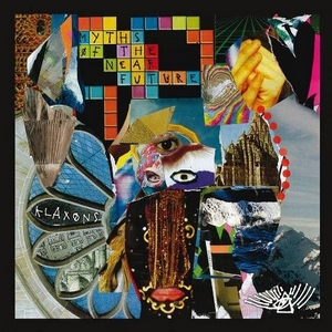
Klaxons album (Myths of the Near Future)
Images
- Front cover - Collage of images:
- Multicoloured crossword with 'Myths of the Near Future' spelt out in some of the squares
- 3 different eyes
- Yellow hands
- Mountain & sky
- Lips
- Random 'cuttings' of different colours/patterns
- Waterfall/sea
- Window of a building - flower shape with 'Klaxons' in one petal shape, and other images (another building and some kind of electronic device thing) in two other petals.
- Back cover - outer space image
- Back of inside sleeve - another collage of images
Collage of seemingly random images linked to style of music - lots of different techniques used in their songs.
Colours linked to 'Nu Rave' genre of music.
Collage maybe also linked to album title.... near future - unfamiliar? - collage of familiar images used to create something unfamiliar and a bit weird. [anchorage]
Text
- Handwriting style (actually seems to be handwritten in the inside cover)
- All upper case letters - more masculine looking handwriting?
- Small on front cover - band and album names not really used to attract attention
- Fairly large on back cover for track listing - stands out and is the most important thing on the back cover
- Track listing in inside sleeve also relatively large
- Small text for lyrics
- Gold text on back cover and in inside sleeve to stand out against the black background
Functions of the front, back and inside sleeve
The front cover is used to attract attention and try and sell the album to potential audience members.
The back cover is used to give a track listing for the album and also give institutional information about the CD (such as copyright, record company and where the CD was made)
The inside sleeve is used to give the audience a set of lyrics for all the songs on the album. Also, the inside sleeve is where the band issues thank yous to their friends, family, colleagues etc.
Iconography
- Nu Rave/Psychedelic genre- reflected in the imagery and colours used on the front cover
- Logo: triangle (pyramid maybe?), eye, lots of lines. - exclusive to the bamd
- Diagonal line through the O's in the band name and title - signifier of the band?
Institutional context
- Polydor Records - quite mainstream. But not a particularly mainstream style of music. Niche genre produced by a mainstream/important record company.
- Not really mainstream genre - unconventional cover (style of imagery on front cover), inside sleeve (half way through the booklet, the text turns upside down)
- First album - not really reflected in cover since the text is relatively small, which would normally suggest that the imagery is of more importance. However, the imagery used doesn't really gives much information about the band itself.
Potential/Target Audience
- Quite niche but the band had mainstream succes... so maybe somewhere in between?
- Some familiarity with band to recognise cover even though the text is small
- Either gender
- Teenagers, students and maybe people in their early 20s

0 comments:
Post a Comment